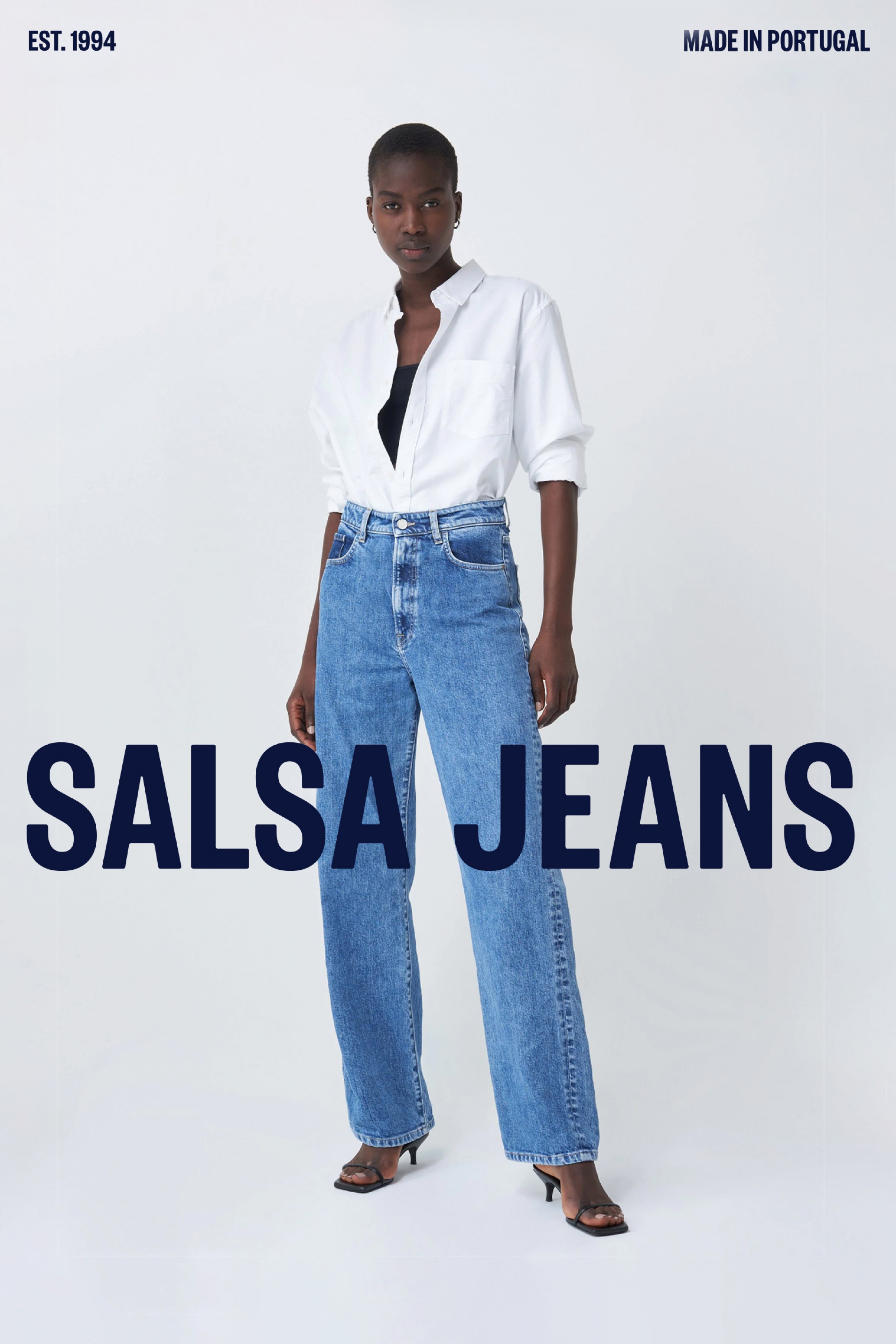
Salsa Jeans rebranding reflects the new positioning of a brand spanning three decades worth of experience in jeanswear. Innovation and technology are a key element of the company’s production values, alongside being an active voice in the global discourse on diversity and inclusivity in fashion. The brand’s new logo is the primary corporate mark used across all its internal and external communication channels.
The logo was developed from the capitalised version of the Founders Grotesk X-Condensed Semibold font (designed by Kris Sowersby and distributed by Klim Foundry). Some of the technical aspects of the typography were adapted according to the values supporting the new visual identity of Salsa Jeans — shape and kerning were edited to improve the logotype solidity and legibility, and the vertices were rounded to soften its perception. The blue Salsa Jeans wordmark represents the brand’s focus on jeanswear. The isotype is drawn from the S and J, intertwined like warp and weft in denim fabric.